
Anyone who is looking to build an online store should be looking for ways to boost sales as well.
Now you can boost your sales without spending extra money on marketing, with better user experience.
How to do it?
It is Possible, by increasing the conversion rates on your ecommerce store.
Conversion rate is what your customer clicks the ‘buy button’, or signs up to your service.
In other words, it is the number of people visiting your site and who turns out to be customers.
Let’s see, 10 User Experience Tips for E-commerce Websites.
The conversion rates are solely important for increasing sales.
That’s why we will optimize the area where maximum conversion takes place. For example: CTA.
A CTA or Call-to-Action is an important element of a page that leads your site visitors into action.
You must have noticed it in product pages, a button labelled as “Buy Now” or ”Add to Cart”.
Apart from this, CTA can make visitors to do other things such as-
Focus to design a personalized CTA when you are building an online store. It won’t address every visitor in separate but it will help you to find them with sales.
For example, if you have an email marketing campaign, you can direct paying customers to a specific landing page and unconverted leading to a different page.
This personalized CTAs as per your customers will help them to take action.
The key to success is to keep the customer journey in mind when you design your CTA.
Fortunately, Our EWDC ecommerce platform is pre-installed with dynamic page features that help you create new pages within minutes.
Moreover, EWDC offers you in-built design tools to assist you in designing and personalizing your CTA buttons.
CTAs are focused in most pages but it’s also important to declutter the navigation menus on your ecommerce website.
You can do this by minimizing the navigation elements on your key pages.
The idea is to direct your visitors’ to the CTA. By decluttering, you will direct them to follow through your CTAs rather than bouncing from one page to another.
For example, a study shows that by excluding the friction elements such as the top and sidebar navigations on checkout pages, you are improving the checkout rates by 10%.
You don’t have to remove all the navigational elements from your website but only very few that distract your visitors from the main purpose of the page.
For decluttering, EWDC can help you. All the sites powered by EWDC offer easy search and navigation tools.
This will allow your customers to find exact matches of the products they are searching, thus it will boost your engagement and conversion process.
While building an online store, images are powerful and can sell a product online.
The power of images is that you can even run your ecommerce store with just images and without product descriptions, but it’s recommended by us.
If you are looking to boost conversion rates for your ecommerce website then having high-quality photos of your product is a must.
The more images you display the happier your customers will be. Also, make the products zoomable, show them from different angles.

Same goes with videos. Images are good for ecommerce websites but video is the future.
We are not discrediting images here, but they have limitations and videos qualify as the next step before actual touching and feeling.
So if you are not doing product videos yet, you are missing out.
Now, this is where ecommerce platforms EWDC come in handy. It not only offers all the features mentioned above but also comes with a 360° view of products.
These features can turn your product pages full of images into high-converting resources.
The role of product descriptions is to give buyers enough information to help them make the buying decision.
The best sales copy should offer full, complete information.
What should be the length of the product description? Should you keep it long or short?
You can offer both in online stores, the concise version and also the longer version.
The purpose of the concise version is to capture the clarity about the product.
The longer version is designed to offer information that the customer will not have a single question left to answer.
Just add keywords in between. Don’t repeat the manufacturer’s descriptions; add your own personal touch and recommendations to it.
When you partner with EWDC, you get a feature-rich platform that is SEO-friendly too. It means you can easily add keywords and Meta in your product description, to rank your site higher in top searches.
What did you think about notifications when you built an online store? Do you too take them as annoying distractions while browsing any website?
To ‘open up’ your eyes.
Pop-up offers such as notifications are quite irritating but only if you don’t know how to use them effectively. When you employ it strategically, they can reduce shopping cart abandonment rates and help you to improve your conversions.
Just make sure your notifications offer useful and relevant information to your ecommerce site’s visitors. Also, if you are offering a promo or a gift, then they are considered a gift.
You can get everything in hand by using the EWDC platform for your online business. It allows you to use notifications and help you with better conversions.
More than half of online shoppers abandon their shopping carts right before checking out.
Yes, just because of a complicated checkout process. It easily makes customers distracted, frustrated, or simply bored.
Don’t you think it’s your responsibility to offer faster check out in your online store? It is.
How to make the payment and checkout process easy?
With one-click buying option for existing customers who are already logged in, this is possible.
Try out an ecommerce platform such as EWDC, its in-built feature to store all your customers’ details for future use.
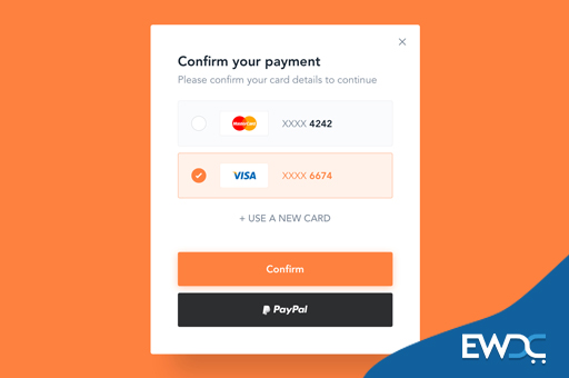
Our single page checkout makes ordering easy without going through the long checkout process.
We offer multiple payment options to your customers for hassle-free purchase.
What about the guest users who don’t want to sign up or sign in?
This is another major reason why customers abandon their carts for the amounts of information they had to fill.
You can give guest users a super-easy way to pay, a “buy as guest” button, and allow them to make shopping easy.
EWDC offers guest checkout facilities to your customers and also allows new customers to buy products easily without filling out unnecessary forms.
To offer free shipping may be tough when you build an online store, but we can help you with that.
Think of it from a customer’s perspective. They have mentally committed to buy something in the prices fixed in their heads, and finally they go to check out.
To avoid this, offer them free shipping on your ecommerce website. You can always price the delivery cost into your products.
The way to entrepreneurship will be easy only if you know the trick.
Here, EWDC comes to your rescue once again offering solutions to all your shipping-related needs.
With its help, you can easily give free shipping to your customers. We also offer multiple shipping options at discounted prices.
Being available to your customers always is a genius way of marketing.
And you can easily earn by displaying your contact info such as your email id and your phone number clearly visible on your online store.
You can also offer live customer support to your customers. Handling your customers’ purchase-related queries will make all the difference you need to boost your sales.
With EWDC, you will always stay connected with your customers as it gives you the freedom to integrate multiple support channels such as online chat, ticketing system etc.
Last but not the least, being transparent goes a long way beyond honesty and detailed product descriptions.
Be upfront and clear about policies and fees on your ecommerce website that may affect your customers.
Majority of customers who abandon their shopping cart are unable to calculate the total order cost.
These hidden costs will surprise your customer and will leave them without completing orders.
To avoid this, make your costs, shipping and return policies clear and easy to find.
By listing all the shipping options along with the return policy on each product page is a good strategy.
This will reduce abandoned carts and helps you to improve the conversion rates of your online store.
With these 10 user experience tips, you can increase the sales of your ecommerce store without even spending extra on marketing.
Check out our other blogs at EWDC. To start your online store, give EWDC a try.
It is the next-generation ecommerce website provider whose platform is compatible with all the features mentioned above and will increase sales in your online store.